


Tuesday 21st October 2025
More than just a makeover
Alexandra Davis
We’ve rebranded but it’s not just skin deep
If you’re a visual person, you might have noticed that Pilgrims’ Friend Society is beginning to look a little different. That’s because we’ve had a rebrand!
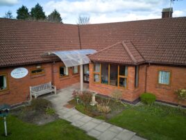
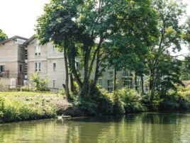
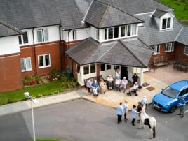
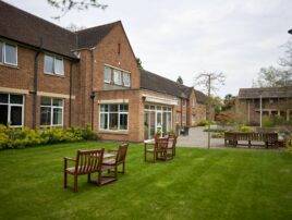
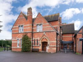
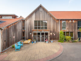
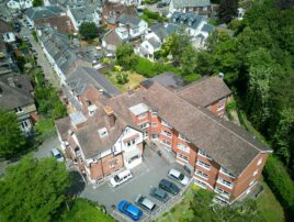
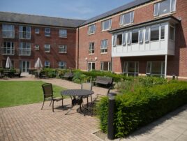
With so much going on within the organisation as we grow and invest in our care homes, our housing, and buildings, we wanted to make sure that our branding was playing a key role in catching the eye and communicating a bit about our work and our vision.
You might notice that our logo has been updated – we’ve kept our name because it’s a crucial part of who we are, but we’ve added a cross and roof element so that it’s a bit clearer that we’re a Christian organisation and that we do something around housing. For people who are new to us, we want that essence of our work to be immediately recognisable.
We’ve also changed our colours. We’ve chosen a darker blue from the one we were using before – it’s a bit more refined and conjures up a sense of heritage, something that we think honours our 218 years of history. Along with that dark navy is a bright teal which is a lovely contrast colour that adds vibrancy and clarity, combining our heritage with our dynamic and vibrant communities that exist today. Alongside that we have a grape tone which adds an extra layer of sophistication and can be complimented with natural blue, green, and yellow tones. We love this palette because we believe it encapsulates who we are in one cohesive visual collection.
And if you’re into fonts, you’ll notice that we have a new serif font for our headlines – DM Serif – and a sans serif font for almost everything else – Plus Jakarta Sans. Occasionally you’ll notice a cursive font called Corinthia which complements our other fonts. We’ve ensured that all these type faces are readable and that they reflect both the tradition of our past with the clarity of our present.
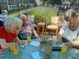
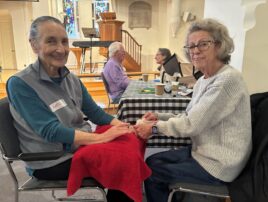
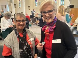
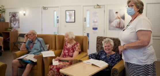
Having said all that, one thing that we’ve kept at the heart of this re-brand is that Pilgrims’ Friend Society is far more than a new set of colours or fonts or a logo. This is branding but our brand is deeply established in our care homes and housing – rooted in our Christian faith, our values of compassion, community, transparency and excellence are what shape our culture and the way we do things at Pilgrims’ Friend Society. Our brand is an expression of our culture to those outside our work – those who keep up with our work from a bit of a distance. And our branding is what represents our brand, culture, and values.
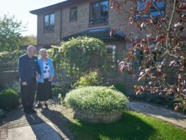
So, don’t worry too much about logos, colour palettes, or fonts. What we really want you to remember about this rebrand is that it’s more than a makeover – it represents the very heart of how we serve the wonderful older people in our homes and housing.
@pilgrimsfriendsociety ✨ New look, same mission. Our rebrand is here — rooted in faith, community, and care! 💙 #rebrand #christianty #socialcare #fyp ♬ original sound - Pilgrims' Friend Society
More from Pilgrims' Friend Society...

Celebrating 40 years of the Christian Resources Exhibition (CRE)
Pilgrims' Friend Society's marketing team exhibited at CRE’s 40th anniversary

A new care home for Crawley
We are pleased to be purchasing land in Crawley with plans to build a brand-new care home

Strong roots, new shoots
Chief Executive Stephen Hammersley marks 10 years shaping Christian care with Pilgrims’ Friend Society and a vision for new homes